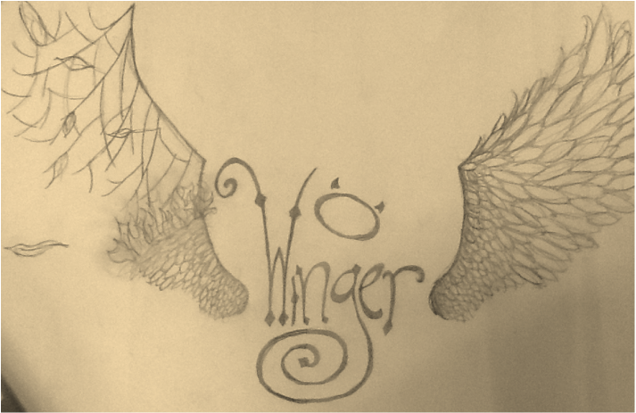
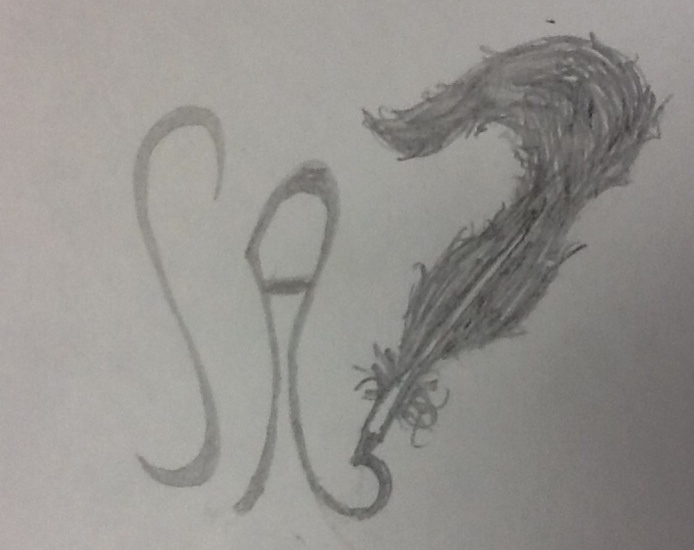
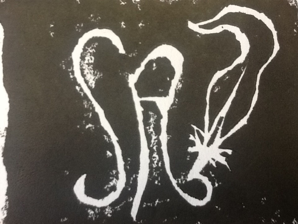
Hey! This is all about my graffiti tag. If you don't know what a graffiti tag is look no further, i will explain. A graffiti tag is a name or some kind of symbol that defines a graffiti artist. Usually it is made in a way that expresses the artists beliefs or their style of art. Mine says a lot about me. I hate the spot light, in fact i have an awful fear of public speaking. So when i made my signature word "Winger" I was thinking about the actually definition of winger. It's someone in a sport mainly rugby) that attacks from the sides, and might even protect the person with the ball on the sides. I like to think of myself as someone who protects others. Again, I hate the spot light. The one wing that's burning is symbolizing someone slightly breaking. The fire is spreading, and destroying the wing. It means that the kind of persona i want to take on, is a continuously self harming one. You have to put others before you 24/7, and sometimes you have to be OK with being taken advantage of. Man talk about a long explanation. I hope you enjoy my blog, and and inspired!
By "Responding" project idea was to take five emotional pictures and show them to people, and then document their thoughts, reactions, and feelings on the picture. People would sometimes say the same thing, especially when it came to how the picture made them feel. But when it came to interpreting the picture, (figuring out the message the artist was trying to send) many were different. This is because people have different mind sets. Sometimes even how you were raised determines how a picture speaks to you. I loved doing this project because I liked seeing their reactions and learning what they thought about pictures I had also thought about and interpreted. Thank you for reading my blog! I admit, I hated this project. I'm just njot good at finding information and putting it into an interesting format! And it didn't help that I chose a difficult topic. Having chosen street artists, a lot of them don't label their drawings, and they do it in secret so their isn't a specific time it was created. all in all i did enjoy looking at their work, because i love street art. Click Here to see my presentation!!!
My second challenge i choose was installation. Installation was when you took a sort of sculpture that is able to be picked up and put somewhere else. For the project a did a chandelier made of wires and hung by fishing line. This project changed so much from the beginning. the original plan was to have it spiraling down and for different colored pencils to be hanging instead of thin wire. then it changed to three tiers but getting them all level made me so frustrated it didn't work. Lastly (and what I have now hanging up in the art room) I ditched the tiers and stuck with one rings with individual coils of thin wire. Because it would take way to long to describe how I did every idea and process I'm sticking with the the last and final idea. In order to get the single loop I took a thicker wire and (using pliers and wire cutters supplied by Mrs. Meyer) wrapped it into a big loop and wrapped the ends together around each other so it would stay in place. Then I took the small thin decorative wire to make the little coils hung around on the loop. To make the coils I put the end of the decorative wire between my middle and index finger and continued to wrap it around my index index finger. To attach the coils in the big loop I bent an end of the coil up separate of the coil it's self and wrapped it around the loop. I did this until it was full. The to make the square center piece I took 4 peice of identical length of decorative wire and attached them to four separate places on the loop making a square when i attached them to each other. To make the peice hanging from the middle I made three different shaped circles and used small wire to bind them together. I then took to bigger pieces of wire, attached them to the center square and pushed down the connecting wire to that it hung down. And there you have it, my Wire Chandelier! Later on I plan to take the wire off and replace it with something else like old paint brushes or maybe shards of glass so when light hit it it shined you know? It's a constant work in progress, and I loved working on it! I had a hard time deciding what i wanted to do for my project. I finally came to the conclusion i wanted to do a portrait of Frank Sinatra. Of course looking at it it isn't exactly a portrait. I started off by searching for a picture of Frank Sinatra on the internet. Yeah i know the whole copy right thing, but trust me its different enough. then i placed a grid on the picture which i would also draw out on the piece of paper the project would be on. I did this so that when I was drawing the portrait i could re-size it correctly and not have a lopsided Frank Sinatra.. Then it was drawing time! (also known as headaches and constant erasing time) I started off in the bottom left corner and worked my way around, paying close attention to were his shoulder ended, or where his hat started so it wouldn't be lopsided. Once i finished the outline i had to really decide what i wanted to do with my drawing. After a little more than 20 minuets, (which honest to God felt like a whole class period) I began my master plan! *bwahahaha* (sorry I'm getting bored typing, gotta entertain myself) I basically drew circles over and over again to add a mixed and shadedish kind of look. then i rubbed all over the background to really mix it. And finally I wrote the words "Frank Sinatra" over and over and over again. Hope you guys like what i have so far. I don't have it done but sometime this weekend or Friday it should be done! Bye! Read the rest of my blog if you want. FIRST YOU HAVE TO GET YOUR PICTURE. YOUR FIRST JOB IS TO GET THAT PICTURE DRAWN ONTO THE LINOLEUM SHEET AS ITS MIRROR IMAGE. YOU WANT TO DO THIS BECAUSE WHEN YOU PRINT IT ON PAPER IT WILL BE THE OPPOSITE OF WHATS ON THE LINOLEUM SHEET. AFTER THAT YOU WANT TO TAKE A WOOD BLOCK AND PLACE IT ON THE TABLE, THIS WILL BE THE ISLE BY KEEPING YOUR LINOLEUM SHEET IN PLACE AND FROM SCRATCHING THE TABLE OR YOURSELF. WHILE CUTTING MAKE SURE TO NEVER CUT TOWARDS FOR BODY OR HANDS.
ONCE YOU HAVE CUT OUT THE PICTURE ON THE LINOLEUM SHEET, YOU WILL TAKE THE PRINTING INK AND TAKE HALF A SPOON FULL AND PLACE IT IN THE MIDDLE OF A METAL SHEET. THEN YOU TAKE THE BRAYER AND SPREAD THE INK OUT UNTIL WHEN YOUR ROLLING THE INK IT MAKES A STICKING NOISE. AFTER THAT YOU PLACE YOUR LINOLEUM SHEET FACE UP ON A BLANK SHEET OF PAPER, THIS WILL MAKE SURE YOU DON'T ACCIDENTALLY GET ANY INK ON THE TABLE. THEN YOU TAKE THE BRAYER AND COVER THE LINOLEUM SHEET IN THE INK PLENTIFULLY. FOR THE FINAL PART, YOU TAKE THE LINO SHEET AND PLACE IT UPSIDE DOWN (INK COVERED SIDE DOWN) ON YOUR FINAL PIECE OF PAPER. PUSH DOWN ON THE LINO SHEET WELL TO PRESS THE INK ON TO THE PAPER. MAKE SURE NOT TO MOVE THE SHEET FOR YOU WILL MESS UP THE PRINT. THEN CAREFULLY PEAL OFF THE LINO SHEET. AND THERE YOU HAVE YOUR FIRST PRINT. DO THIS CONTINUOUSLY UNTIL YOU MAKE PRINTS THAT LOOK GOOD. To start my logo design i drew three different drawings of what I thought I would want my logo to be. The logo was suppose something that I enjoyed doing or liked. Instead I decided to do my initials in a font that fit my style. Adding the feather was more of just a way to fill space and add character and meaning, so it wasn't just my initials in a swirly font. I admit, I'm O.C.D. so it took me a few tries to get the logo to my liking. (and when i say a few i really meant i used up 5 pages of scratch paper front and back for a 2x3 inch picture) I really enjoyed creating my own logo. |